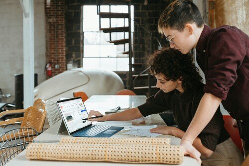
Choosing the right visual style can feel surprisingly philosophical. Your design is polished — now you need to wrap it around a device that makes it look alive. Enter the laptop mockup. Three dominant styles compete: isometric, flat, and perspective. Each tells a different story. Knowing which to reach for? That’s where designers either shine or stumble.
What Makes Each Style Tick
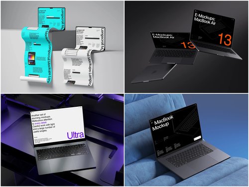
Flat mockups are a straight-on, zero-distortion view of the screen. Clean. Simple. They put your UI front and center with no distractions — perfect for app screenshots, case study thumbnails, or anywhere the interface is the message.
Isometric mockups sit at a charming 30-degree angle that feels geometric and structured. They blend playfulness with professionalism, beloved in tech illustration and SaaS marketing for delivering depth without messy distortion.
Perspective mockups mimic how your eye actually sees a laptop — with foreshortening and vanishing points that create a photorealistic pull the other two styles simply can’t match.
When to Use Which Style
Picking a style isn’t about personal taste — it’s about context and what you’re selling.
- Use flat when clarity is non-negotiable: UI documentation, product walkthroughs, or anywhere distortion would obscure detail
- Use isometric for branding, social media graphics, or startup pitch decks where you want to feel modern and editorial
- Use perspective when realism builds trust — client presentations, portfolio hero sections, or agency proposals
Ask yourself: do I want my audience to study this design, admire it, or believe it? That question leads you straight to the right choice.
Real Examples of Laptop Mockups in Action
A SaaS company launching a dashboard might use a perspective laptop mockup on their hero section — the slight angle makes the interface feel tangible, like you could reach out and click it. Depth creates subconscious credibility.
An independent designer publishing a Behance case study might reach for isometric compositions to make their portfolio feel curated and design-forward. The geometric precision signals craft without feeling sterile.
A UI/UX freelancer building a pitch deck? Flat mockups keep screenshots readable during Zoom calls where tiny details get lost in compression. Even app store submissions benefit — Apple’s guidelines practically beg for clean flat displays where the product speaks for itself.
A great laptop mockup doesn’t just display your work. It frames it — shaping how viewers feel before they’ve read a single word.
Laptop Mockups on ls.graphics: Quality Worth Knowing
When it comes to sourcing mockups that hold up under scrutiny, ls.graphics has built a reputation designers genuinely trust. Their collections reflect a level of craft that separates them from the generic stock-mockup crowd.
What makes them stand out:
- Ultra-realistic rendering — lighting, shadows, and material textures look indistinguishable from actual photography
- Organized layers — PSD and Figma files are structured logically so swapping your screen in takes seconds
- Multiple angles — flat, isometric, and dramatic perspective views are all covered in a single collection
- Color style variations — silver, space gray, and custom themes let you match your brand palette without hacking files
- Stylish minimalist compositions — pre-built scene layouts with subtle props and clean negative space feel editorial without being distracting
Everything slots into a professional workflow without friction. You’re not adapting a clunky file to your needs — the mockup adapts to you.
Conclusion
Flat wins on clarity, isometric wins on style, perspective wins on realism. There’s no universally “best” — only the right choice for your specific moment. The smartest designers know all three and deploy them intentionally.
What matters equally is quality. A poorly rendered mockup in the right style still undermines your work. That’s why resources like ls.graphics exist — to give designers presentation tools genuinely worthy of the designs they’re showcasing. When your work is good, it deserves a frame that matches.